I am a longtime fan of Formula 1 and - as fellow fans might know - there is always a debate about who is the greatest of all time - especially after these years when Lewis Hamilton delivers championships after championships. I thought in this particularly exciting season it’s the right time to build a dashboard to answer that question.
Data Sources
I worked with data from two sources. My first source was the Ergast Developer API which contains all of the historical data regarding the sport. My other data source was based on STATS F1, which contains all of the driver images to make my dashboard prettier. Unfortunately, the driver images weren’t available to download in bulk from the site and even if they were, I still had to link the foreign IDs from the Ergast Developer API to insert the images to my data model, there I created a simple Python script/scraper to download each drivers’ images from the site.
The script
First, I had to import all of the libraries that I used while I created my scraper and loaded my dataset from Ergast Developer API:
1from bs4 import BeautifulSoup2from urllib.request import Request, urlopen3import pandas as pd4from time import sleep5from time import time6from random import randint7import validators8from unidecode import unidecode9from urllib.error import HTTPError10from urllib.error import URLError11df = pd.read_csv('./drivers.csv')
Secondly, I defined my function to get the driver images with exception handling in case the driver names in the Ergast data are not identical to the driver names on Stats F1 and the later generated Stats F1 profile URLs are invalid:
1def get_image(url):2 try:3 page = Request(url, headers={'User-Agent': 'Mozilla/5.0'})4 webpage = urlopen(page).read()5 soup = BeautifulSoup(webpage,'html.parser')6 imagehtml = str(soup.find('div',class_='pilotepic'))7 start = imagehtml.find('src')+58 end = imagehtml.find('style')-29 return 'https://www.statsf1.com'+imagehtml[start:end]10 except HTTPError:11 return 'URL invalid'
After that, I generated the beforementioned Stats F1 profile URLs from the drivers’ names and defined two lists that contains the IDs and the profile URLs for each ID:
1driver_id = []2driver_profiles = []34for index, row in df.iterrows():5 id = row['driverId']6 forename = row['forename']7 surname = row['surname']8 driver_profile = 'https://www.statsf1.com/en/'+unidecode(forename).replace("'","-").replace(" ","-")+"-"+unidecode(surname).replace("'","-").replace(" ","-")+".aspx"9 driver_id.append(id)10 driver_profiles.append(driver_profile)
From the lists I created a dictionary first, and then a pandas DataFrame:
1data = {'id':driver_id,'url':driver_profiles}2df_images = pd.DataFrame(data)
Based on the generated URLs my previously defined function ‘get_image’ can be called and a new list with the image URLs can be populated:
1image_url = []2for index, row in df_images.iterrows():3 url = row['url']4 images = get_image(url)5 image_url.append(images)
Lastly, a new dictionary is created based on the three lists and a DataFrame from this dictionary to export the dataset into a .csv using pandas’ built-in function:
1data = {'id':driver_id,'url':driver_profiles,'images':image_url}2df_images = pd.DataFrame(data)3df_images.to_csv('./driver_images_statsF1.csv',index=False)
Missing values could be found in the exported dataset as not every driver’s name is identical in both datasets, therefore the missing driver images are found by searching for them manually on Stats F1.
Methodology
With having explained the data sources I should clarify what methodology I used to be able to compare different drivers. In Formula 1 - as in any other technical sport - the equipment (the car) has a significant influence on one’s performance and results. In my opinion, this factor is something I should not account for in my model as there is no way to fairly determine any constructor’s car performance without bias and I also have kept in mind that usually, the best drivers drive for the top constructors.
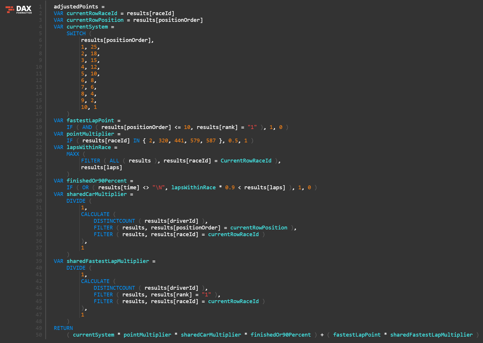
Formula 1 had 20 different scoring systems for the championship since the first GP was held in Silverstone in 1950, therefore comparing points scored by drivers would not be a proper way of comparing drivers. Also, the number of races increased over time resulting in more points achieved in the modern era. While in the ’50s and ’60s the average number of races per season was under 10, from 2016 the number of races is above 20 - with the exception of 2020 with its ‘COVID calendar’. To counter these distortion factors in my model I used adjusted points per GPs (Grand Prix) entered. I considered all results for each driver and calculated what their total points scored would be if Formula 1 had used the same scoring system they use today.
The DAX formula I created can be seen below:

The Dashboard
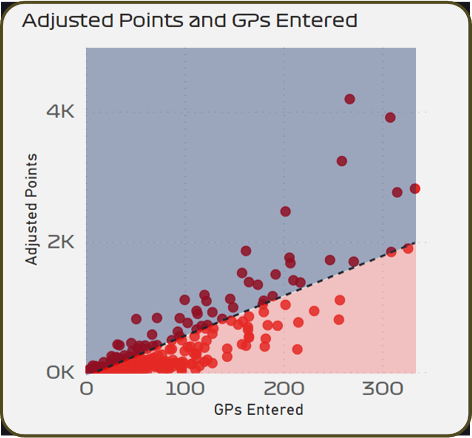
My Dashboard contains 5 different pages. On the ‘Driver Overview’ page you may search for any driver that competed in Formula 1 and see their most relevant statistics (world championships, highest race finish, highest grid position, GPs entered, points, and the newly calculated adjusted points), the points scored by constructors and years and a scatter plot with each driver.

The red area contains all the drivers that are performing under average, while the blue area shows the better than average pilots. Usually, the closer a driver is to the top left corner, the better they are regarding the newly introduced measure, adjusted points scored per GPs entered, however, the high-performing drivers usually have a longer career and the available points are also limited to 26 per GPs, therefore they can be found in the top right corner.
On the ‘Driver Comparison’ page you may select any two drivers to compare their stats. ‘Race Recap’ page is created purely because I wanted to try Charticulate and its capabilities to create custom charts. You may select any race in the past and see what each drivers’ position was lap after lap. ‘Track Overview’ page lists all tracks that were present in the calendar at any time in a championship and shows the top-performing drivers on the track, the first race, the last race, and the number of races held as well.
In Formula 1 - like in most of the other sports - success is measured in world championships won. Being the best in my opinion should not be based purely on the adjusted points per GPs entered, but on adjusted world championships won, however, this can be an interesting measure to discuss. With this measure, Georg Amick is the best (18 points per GPs), Lee Wallard is the second (16,5), Juan Manuel Fangio is the third (15,96), Lewis Hamilton is the fourth (15,70) and Alberto Ascari is the fifth (13,22). If you haven’t heard about George Amick and Lee Wallard despite being a Formula 1 fan, you are not alone. This measure clearly cannot account for the outliers who completed very few races but performed well on those. George Amick entered 1 GPs total where he finished 2nd (rewarded with 18 points), while Lee Wallard raced on 2 GPs, finishing 1st (25 points) on his first and finishing 6th (7 points) on his second GP.
To counter the outliers I created the ‘What If?’ page which determines who should have won championships in each year based on the adjusted points. If Formula 1 had used the scoring system that is in effect today, Alain Prost would be a 7-time world champion joining Lewis Hamilton and Michael Schumacher. The most adjustment in championships also goes to Prost (3), while Damon Hill, Eddie Irvine, Graham Hill and Luigi Fagioli would also get an additional championship to their names. This page shows how undervalued Alain Prost is, while - based on the adjusted championships won - he is the best in Formula 1 with Michael Schumacher and Lewis Hamilton. Based on purely adjusted points per GPs (without the outliers) Juan Manuel Fangio would be the greatest of all times in Formula 1.
Sources and Tools Used
Data
Other Resources
Tools
Python for data scraping
Charticulate for custom visual